
We’ve all said it while using a website, immediately realized we sound like our parents and recoiled slightly in horror as the full implication sinks in:
I used to be able to do this, but they’ve moved the button and I can’t do it anymore
We’re getting old, no longer able to adapt to change and in danger of being a victim of natural selection as the young and fit outcompete us in cyberspace. This isn’t quite as melodramatic as it might sound - imagine a grocery website which you rely on to deliver food to you where you simply can’t find the order button anymore.
We shouldn’t be putting people in this position. Let’s talk about how we should evolve user interfaces by allowing change without breaking the user experience.
The greatest power user ever seen
As a developer of a UI you are the greatest power user ever seen: you know where everything is, the full gamut of functionality, all the keyboard shortcuts and the fastest way to achieve everything. In addition, you work with other people who are also power users by virtue of their connection with the product and collectively you will suffer from several cognitive biases when making decisions about how to evolve and improve the product’s UI. It’s easy to forget that your real users only know how to use some of your product’s features, may use them without fully understanding them and rely on familiarity to use them efficiently. Yours is just one of many UIs they use in their job and life and they will be frustrated by any idiosyncracies in your design which they have to struggle to remember.
Change is the only constant: you need to be able to update your product with new features and constantly improve it to keep ahead in the game. You make these decisions on a daily basis, discuss them constantly with your colleagues and keep your team updated in your standups.
Your actual users, on the other hand, will know nothing until one day - not necessarily the day of release, but possible weeks or more later - they get dumped on them not just your one change but many changes written by many developers all in one go! They may find themselves frustrated and alienated if their previously familiar workflow no longer works and irritated that they have to work out what changed and how they can continue doing what they need to do. If you’ve made it onerous or even impossible they may start looking at other products that better suit their requirements.
Here are four ways of mitigating this scenario and making sure you can continue to evolve your user interface without alienating your users:
Consistency
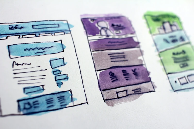
Display and behavior are inextricably linked - if something looks like a button, you expect to be able to click on it to perform an action described by a couple of words or maybe a self-explanatory icon. These relationships come from the physical world and are empirically intuitive to humans through hundreds of years of design.
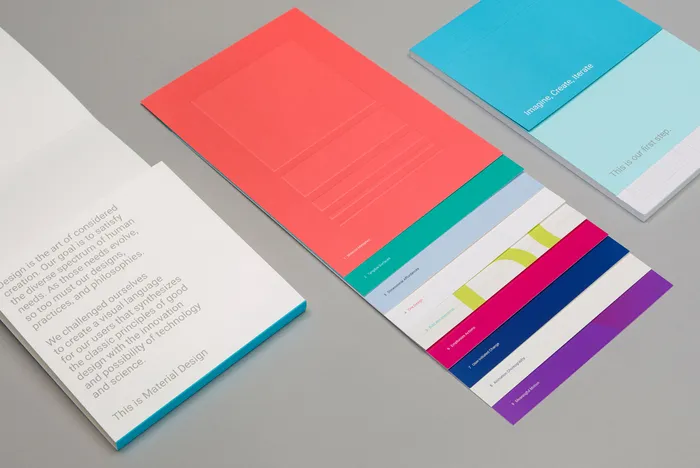
This physical emulation was embraced by Google with their Material Design philosphy. This is an interesting read for anyone involved with UI design even if you don’t use Material in your product.
A material metaphor is the unifying theory of a rationalized space and a system of motion. The material is grounded in tactile reality, inspired by the study of paper and ink, yet technologically advanced and open to imagination and magic. Surfaces and edges of the material provide visual cues that are grounded in reality. The use of familiar tactile attributes helps users quickly understand affordances. Yet the flexibility of the material creates new affordances that supercede those in the physical world, without breaking the rules of physics.
One of the original aims was to provide a more consistent experience for users of Android, both within and across apps and the operating system so that any user has an initial familiarity with any application on which to build.
If your product has a consistent interface then your users will find they can use new features because they behave in ways that are consistent with features they already know how to use.
Data-driven decisions
You should capture metrics and statistics on behavior - read Frankie’s excellent discussion on that topic. When you have this data at your disposal you can have informed discussions about what features are popular, rarely or never used and how people access them.
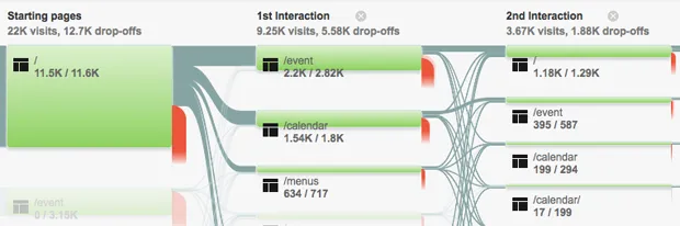
When you want to add a button for a new feature you will know which other actions need to be visible and in primary positions versus those which could be moved to secondary positions to make room for your new one instead of simply holding your finger in the air and making a guess. You can find data on the most popular options for an action and use these as defaults so that the user can just press go without having to twiddle toggles into the same state every time, reducing clicks and increasing efficiency.
You should continue to monitor the same metrics after the release as a comparison to make sure you improved rather than worsened the user experience - you should see the same goals accomplished with fewer clicks and page views If you have a statistically significant user base you can couple this with A/B testing and safely test ideas out when there is no obvious way forward.
Stack half full
In any team there are those with a stronger affinity towards front-end work and those who prefer the back-end. This is natural and should not preclude any developer from working across this boundary but once this divide starts to appear it can widen rapidly as work starts to be handed off across the boundary and each side feels less involved in the other.
If you feel that front-end work is harder to do, sit with someone who feels more comfortable with it and talk through their decision making in building the UI. There are often implicit patterns which they can make explicit for you, removing the mystery and explaining how you can integrate your changes to the front-end work while adhering to the overall look and feel.
Education
However intuitive your product it is likely that some education of your users will always be required once it evolves beyond the trivial. They can be divided into two camps: brand new users who are trying your product for the first time today and need to explore its functionality and long-time users who need incremental updates on the new features and changes.
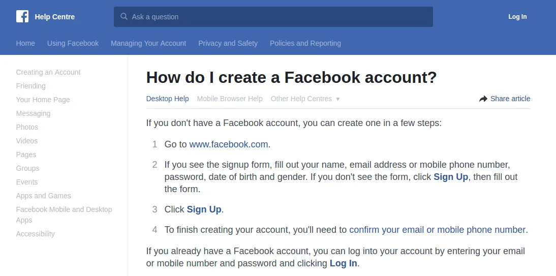
Traditional approaches - the thick reams of a guide or FAQs are daunting and difficult to use for both groups. For them to bear any relation to the UI requires up-to-date screenshots or short videos, protracted descriptions or step-through sequences which the user must memorise before switching back to the UI to try it out. This example from Facebook contains several steps referring to a form you may or may not see, a sign up button you might have to click twice, a mysterious final step and so on which could easily be broken by a simple change to the UI such as, for example, changing the button to read “Create account” instead of “Sign up”.
The developer as well will struggle to keep guides up-to-date as it’s hard to even know when you’ve invalidated them with your code changes. Once you embark on updating the guide the effort of re-recording a video or taking a new sequence of screenshots will quickly discourage you from making change and your user experience will stagnate.
re-learn
To help make user education easier and inspired by help bubbles which appear in products by Google, Twitter etc I wrote a library called re-learn with the following aims:
-
Display “lessons” on the UI right next to the elements they describe
-
Define the lessons as data right next to the code that creates the elements
-
Support incremental introduction of new features to existing users
-
Work with UIs built with React and require no dom manipulation or special markup
You can try the live demo at https://oliyh.github.io/re-learn/ to see the functionality for yourself. Here’s a short video of the demo in use: https://oliyh.github.io/re-learn/.
It requires that your UI is written in reagent but nothing more and produces simple markup which you can style as you please using your own CSS.
A lesson can be defined for a reagent component in the following way:
    (require '[re-learn.core :as re-learn])

    (def todo-input
      (re-learn/with-lesson
        {:id          :todo-input-lesson
         :description "Add new todo items by typing here, pressing the Add button to save"
         :position    :bottom
         :version     1}

        (fn [] [:div
                [:input {:placeholder "What needs to be done?"}]
                [:button "Add"]])))
With the documentation right next to the actual element, it’s easy to keep it updated.
The lesson will appear to the user like this:
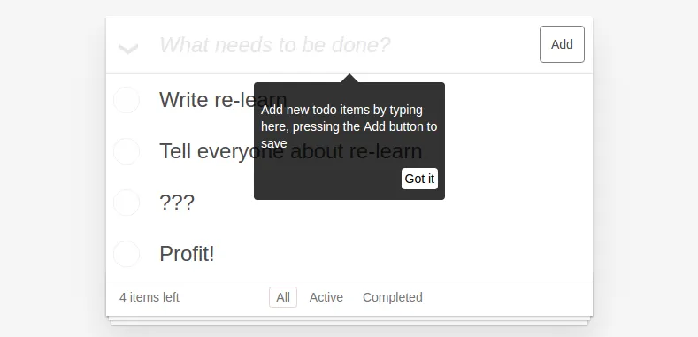
Because the lesson appears on the UI and points to what it refers to it’s easier for the user to understand and provides much more context. When the user has “learnt” the lesson it is stored in local storage so that they won’t see it next time they use the product.
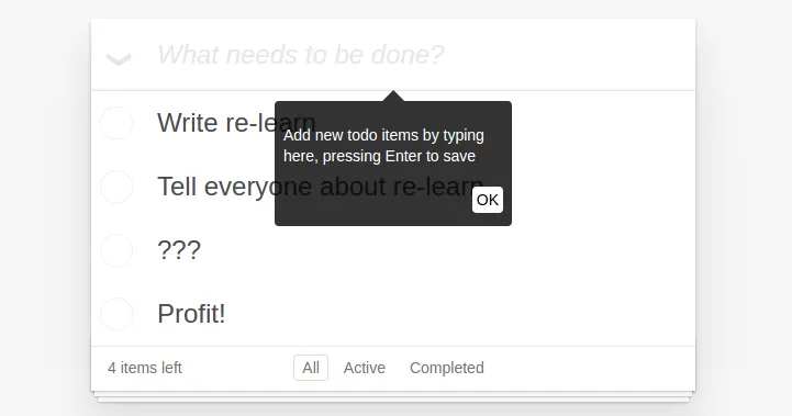
If we decided to make the UI cleaner by removing the Add button and
letting the user just press Enter instead - a change which could be
confusing enough as to stop people using the product - we can simply
update the description and increment the version number of the
lesson:
    {:id          :todo-input-lesson
     :description "Add new todo items by typing here, pressing Enter to save"
     :position    :bottom
     :version     2}
Users, old and new, will be shown the lesson so that they understand the new behavior:
For new users, the features of your product are displayed in simple steps as they start using it, allowing them to discover all the features and giving them confidence. Existing users are kept abreast of your new features as they are introduced without having to delve into documentation or release notes.
Paying attention to these areas of UI design - consistency, data-driven decisions, familiarity with the UI’s principles and user education should allow you keep evolving your user interface without fear of alienating your users.
re-learn is on Github, feedback and contributions are very welcome.


