A cautionary tale
So you’ve written your code and Everything Works. You have tests in many flavours - the vinegary tang of units, the smoky meat of integration and the exotic fruityness of acceptance tests, and they all pass. Everything is just as it should be, so you ship it and head to the pub, a twinkle in your eye as you reflect on a job well done.
Partway through recounting to your rapt colleagues how close a squirrel came to knocking you off your bike that morning, you feel a buzz in your pocket. You ignore it and continue the story but you’ve lost your audience - everyone else is checking their phones. Annoyed, you assume some user hasn’t been able to cope with some minor UI change and panic-paged the whole dev team. You’re mentally preparing your aggressive squirrel impression to continue your story with when you read the message with disbelief. It’s from Stoffel, the hardworking support veteran, who tells you that no one can see the app’s menu and the US offices of FuzzyKitten Inc will be unable to fill their quota of kitten gifs that day.
What happened?
Upon returning to the office, having (in your own mind) completely convinced the security guard that you are totally sober, you bring up your local development environment and find that the menu just isn’t there. An inspection shows that the DOM is indeed correct, but a last minute CSS change to add a picture of a cat in a party hat celebrating the company anniversary made the whole menu render off the screen where it can’t be seen.
You had such confidence that your app was functionally correct and could be driven by your tests you forgot to ensure that it could be used by a human.
Who you gonna call?
The missing menu left a big enough hole in the UI that anyone familiar with the system could have spotted its absence easily, but the automated test and deployment pipelines have no human involvement. Having someone test this sort of stuff manually would involve a tedious trawl through the app, navigating to every page, trying to fabricate edgecases to make sure everything displays properly.
We don’t want any manual processes, though. Additionally we can already use devcards during development to show us how the UI will render in a variety of cases, including rare edge cases. All we need is an automated comparison of these to a known “good” version.
kamera is a library to help with visual testing. It works on the concept of test “targets” which consist of:
-
A url (the “actual”)
-
A reference image (the “expected”)
-
Instructions for comparing the actual to the expected
kamera will use Chrome to visit the url and take a screenshot, then uses
ImageMagick to normalise and compare the actual and expected images. It
runs assertions with clojure.test and can then build a report of all
your targets that has a summary:
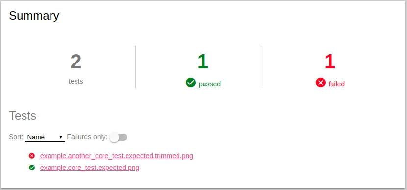
i. a detailed report for each target …
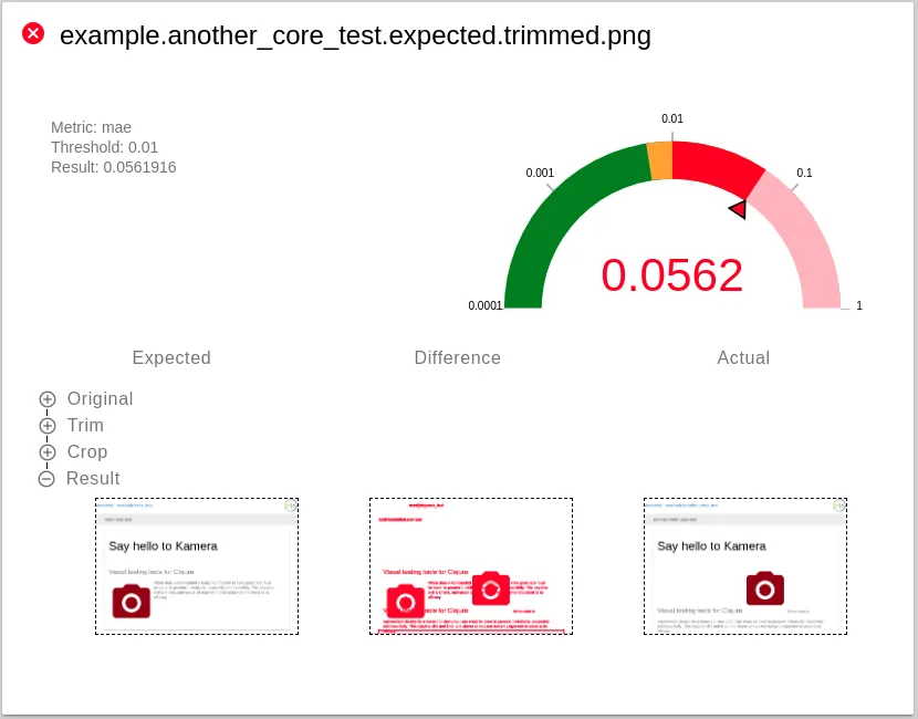
i. and a linked magnifier which helps you see exactly what the differences are:

with devcards
I find devcards a great way of demonstrating how the UI will represent many kinds of data. You can see all your edge cases in one place and code against the multiverse of all simultaneously occuring states, rather than just the one you might see while navigating through your app.
For this reason your devcards are a better test of the components of your app than the app is itself. kamera has a devcards API which works with figwheel-main to let you test all your devcards really simply.
With the following devcards source files:
test
└── example
    ├── another_core_test.cljs
    └── core_test.cljs
i. and a directory populated with reference images, named in the same way:
<!-- -->test-resources └── kamera ├── example.another_core_test.png └── example.core_test.png
i. you can run kamera to screenshot the devcards and compare to the reference images with this:
(ns example.devcards-test
  (:require [kamera.devcards :as kd]
            [clojure.test :refer [deftest testing is]]))

(deftest devcards-test
  (let [build-id "dev"
        opts (-> kd/default-opts
                 (update :default-target merge {:reference-directory "test-resources/kamera"
                                                :screenshot-directory "target/kamera"}))]

    (kd/test-devcards build-id opts)))
without devcards
Although devcards are better tests of the app’s components, there is still room for asserting that the app itself still hangs together properly. Think of it like unit testing vs integration testing - good to have both as they serve different purposes.
kamera’s core api exposes the “targets” discussed earlier, so you could write a test for your app like this:
(k/run-tests
 [{:url "http://test.my-app.com/"
   :reference-file "home-page.png"}

  {:url "http://test.my-app.com/help"
   :reference-file "help-page.png"}

  {:url "http://test.my-app.com/preferences"
   :reference-file "preferences.png"}])
You could also combine it with a webdriver test, making assertions as you go.
Aren’t they brittle?
You may think that asserting on individual pixels in your app’s display is a step too far. I don’t advocate that, and kamera is a little more flexible.
For starters you can adjust the tolerance allowed to each image comparison, adding leniency to avoid test breakage for changes which are genuinely minor. Interestingly this lets you prove that UI changes are minor by the change in the test result.
By using devcards you also restrict the input dataset to one closely linked to your UI, meaning you should be able to safely change business logic without affecting your devcards. If you genuinely intend to update the visual representation then you will need to generate a new “expected” file - just copy kamera’s “actual” file into your resources once you have reviewed it and are happy that the change is what you would like. Your commit now contains an image file showing what your new UI code actually does!
kamera is a tool for visual testing. For ideas on comprehensive testing of UIs have a look at my last blog post.
As always, kamera is on Github and suggestions, feedback and pull requests are more than welcome.
What about that squirrel?
Weeks later, after employing kamera to test your application, you are having a relaxed cycle home through a warm summer evening, the sun dappling through the trees overhead and the quiet hum of your tyres calming your mind. The sharp crack of on acorn hitting your helmet startles you momentarily. Looking up, distracted, you fail to see the small figure waiting for you on the path ahead…

